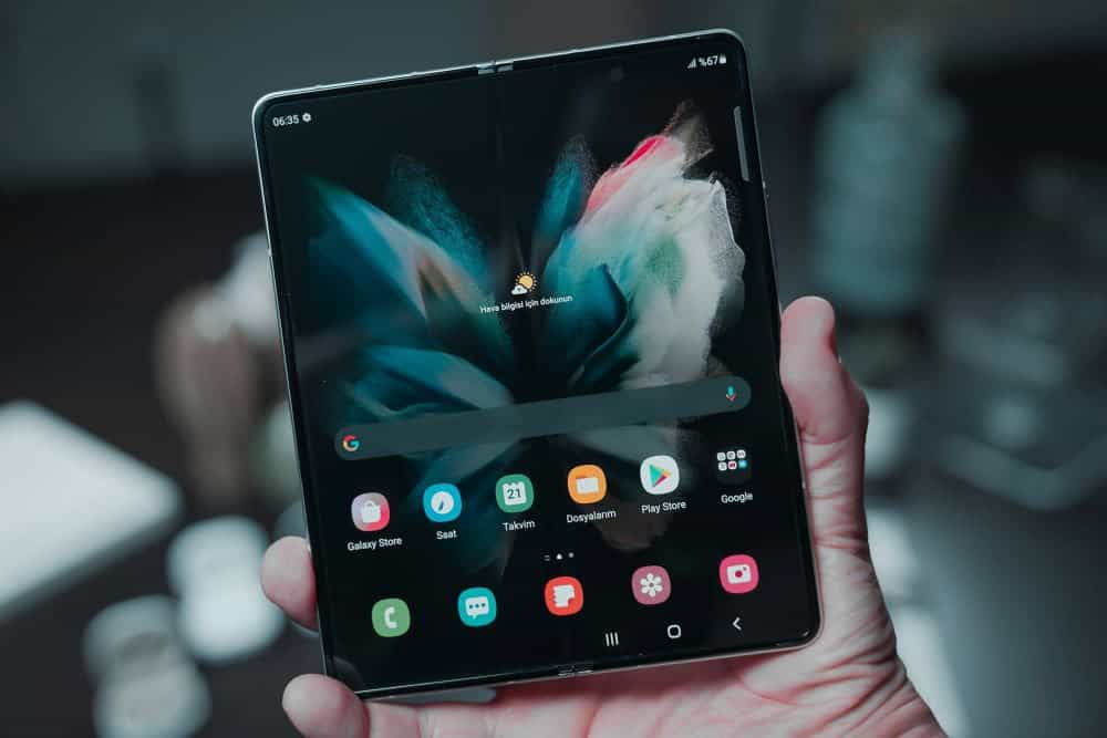
Let’s admit that iOS devices can get pretty one-toned and boring at times. There is not much you can do in terms of customization. But we still love it, and this loves sparks the creativity element inside us. From changing the style and color of your wallpaper to rearranging the icons – we can create a much more personalized experience. And that’s what we are going to talk about – the best iOS 15 home screen ideas in this piece.
We will show how to create the most eye-catching home screen customizations – and that too without jailbreaking or installing any 3rd-party apps on your phone.
iOS 15 Home Screen Ideas: Why Do We Need These?
We as humans are bound to be curious and have always aimed for better efficiency.
It is the same urge that makes us play with our iPhone screens. At times we want to organize our apps so that we can have better access to them. Sometimes we just want to see them differently and look cool.
Whatever your reason may be, these iOS 15 home screen ideas are going to take your customization game to the next level.
So, let’s get rolling.
1- Super-Organized (With Emojis)
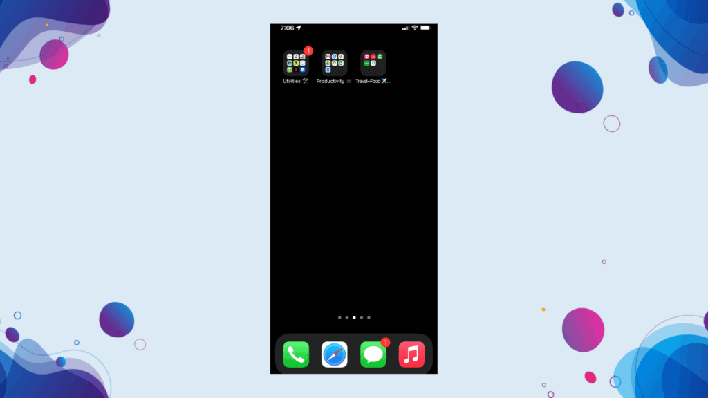
This one is one of our favorite and probably the easiest ideas to set up – perfect for people who are new to iOS customization.
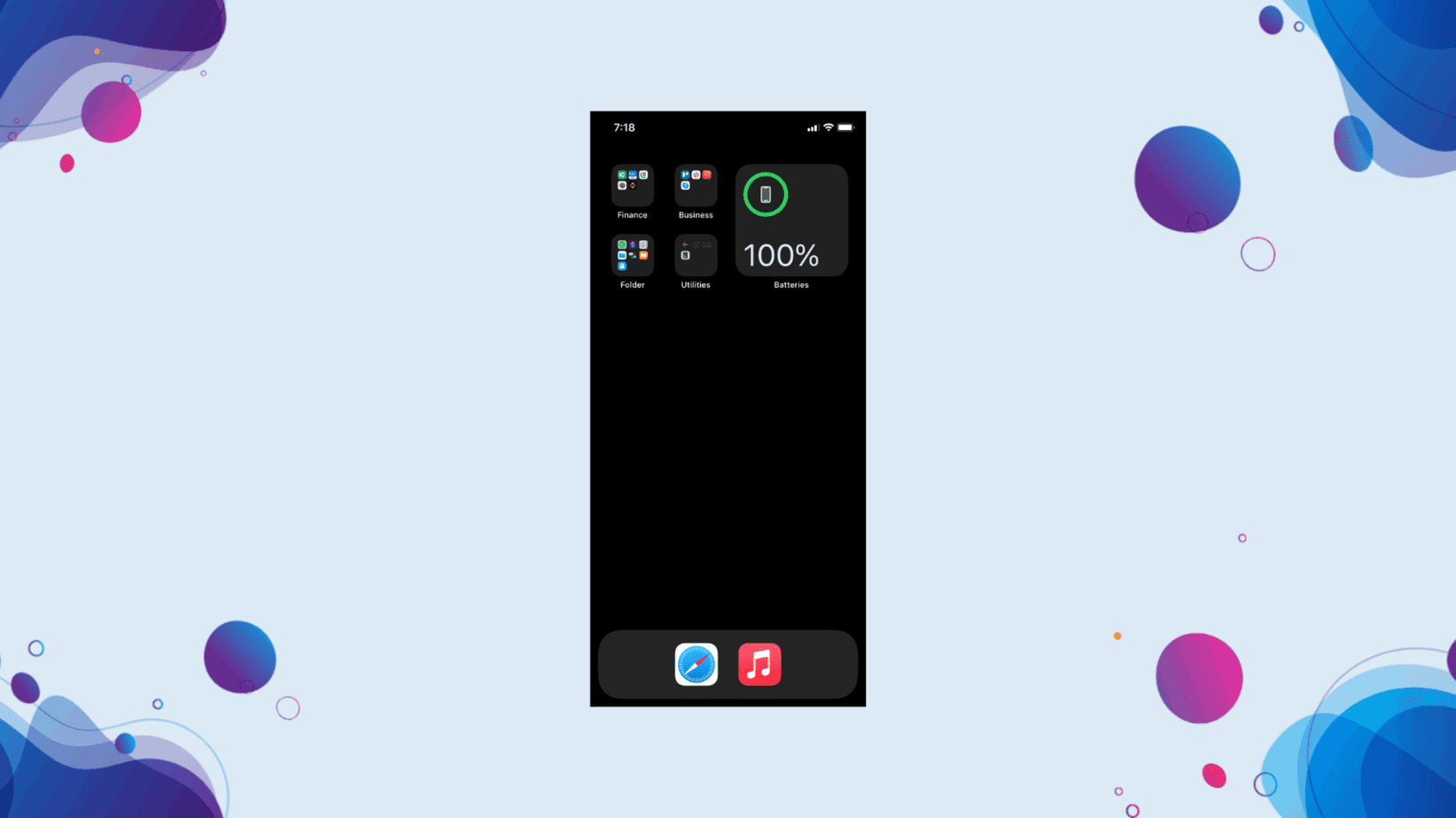
All you have to do is group your apps based on their category by creating different folders. For example, all social media apps can be grouped and placed in one folder, while all news apps can come together in another folder.
Organizing your apps in folders not only gives you quick access to them but also provides a soothing outlook to your device.
You can name your folders whatever you want to. Btw, I call my social media folder “let’s waste some time” 😀
Don’t forget to check Fornite Coming Back to IOS via GeForce Now but With a Catch.
Pro Tip:
Not everyone does it, but when naming your folder, you can even choose an emoji – it looks super-cool.
2- The Tidy Screen: Cleanest iOS 15 Home Screen Idea
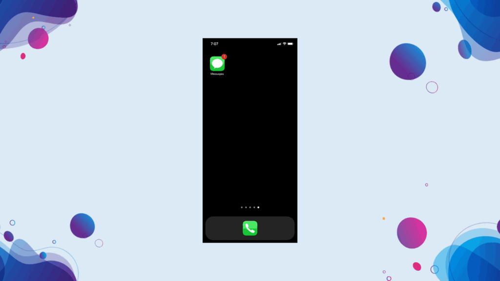
This iOS 15 home screen idea is so creative yet effortless. It de-clutters your home screen like anything.
Start by removing all the apps from the home screen. You will only be able to access them from the app library then. Then choose a single app and make it sit pretty in the middle of the dock.
We have coined this particular idea with respect to the theory of minimalism. By tidying up your screen with just a single app (call app in most cases), you are re-stressing the idea we all have forgotten – phones are just gadgets to call/message the people close to you.
Trust me, it may sound weird, but once you get used to it, you won’t find any other home screen ideas working for you. And it would help you to consciously use your phone rather than the other way around.
Pro Tip:
If you don’t find the app library handy, you can arrange all your apps on the second page of your home screen. The idea is to just keep the first page neat, sweet, and to the point.
3- Getting Creative With Colours
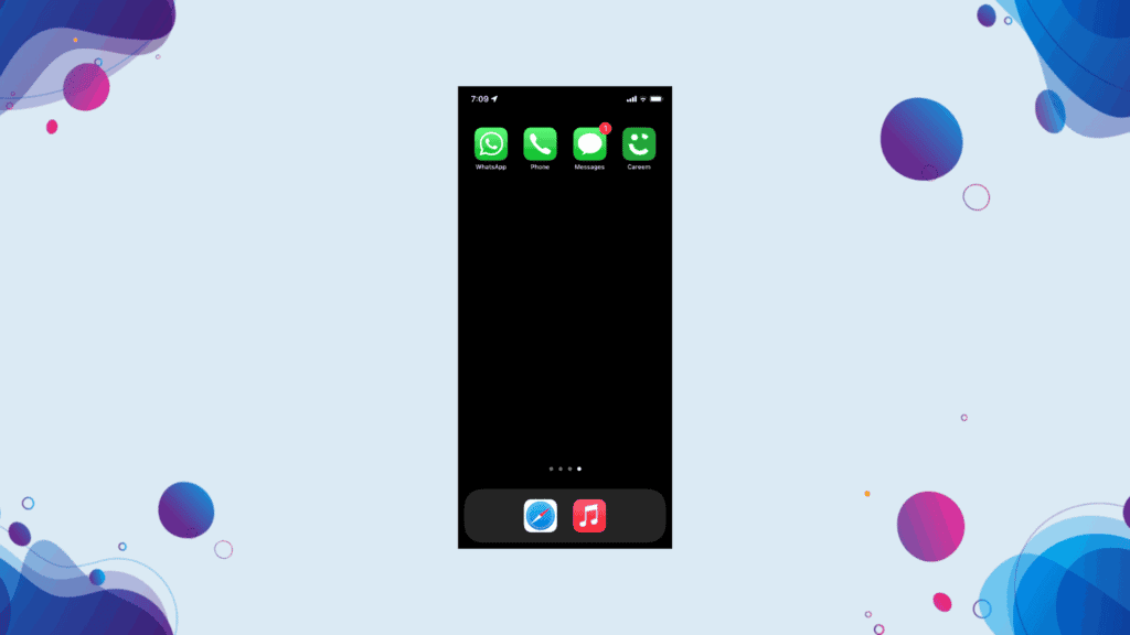
App icons come in different colors. For instance, default communication icons like messages, call, and Facetime are green.
And this gives birth to one of our most out-of-the-box iOS 15 home screen ideas.
Place all the same-colored icons (like green icons) on one page and the other color-matching icons on the subsequent pages.
The icons that are grey or multicolored can be placed in the dock or have their own page.
Pro Tip:
You can get even more creative by creating a page mix of blue and yellow colored icons.
4- The Widgets + Icons (Approach # 1)
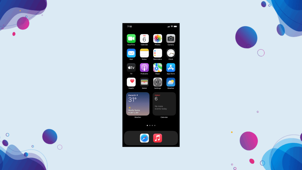
As a long-life iOS users, we are bored with icons – like we are seeing them since the beginning.
However, with the addition of widgets on iOS 14, things have changed. Now, widgets are the new buzz in town.
Widgets are available for the majority of apps. You can pin them to your screen with your regular icons and give the home screen a whole new look.
Weather, batteries, calendar, photos, App Store, and you name it; there are a bunch of widgets available to help you breathe a new life into your home screen.
Pro Tip:
Many widgets come with a set of variants, do check them all to pick the perfect one for your home screen.
Check 30 Best Rainmeter Skins: RANKED (2022)
5- Widgets + Icons (Approach #2)
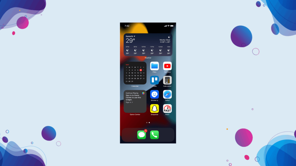
There’s another approach we would like to share with you guys when using the underrated combo of widgets x icons.
Align the widgets from top to bottom, and make sure to leave a 2 x 2 room on the left or right side of your screen. Then add your most-used apps there to make a simple yet useful layout for your iPhone, iPad, and iPod.
Pro-tip:
Add an aesthetic wallpaper to this layout to make your iOS 15 home screen super attractive.
6- One Screen Supremacy
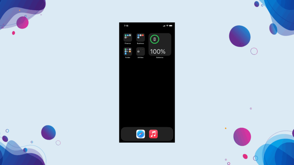
As they say, beauty lies in simplicity. Well, this idea is the living proof of it.
One screen supremacy iOS 15 home screen idea keeps all of your apps on one single page – no second page.
Start by grouping all the similar apps in a folder. For instance, align all communication apps like phone, messages, Facetime, Whatsapp, etc., in one place. Then start placing the folders from the top left side of your screen as per each group’s priority.
While you are at it, delete all the apps you aren’t using for the past 30 days. This will help you easily arrange the apps.
Pro Tip:
You can also utilize the dock if you are running out of space on your home screen to add folders.
7- No Dock Icons
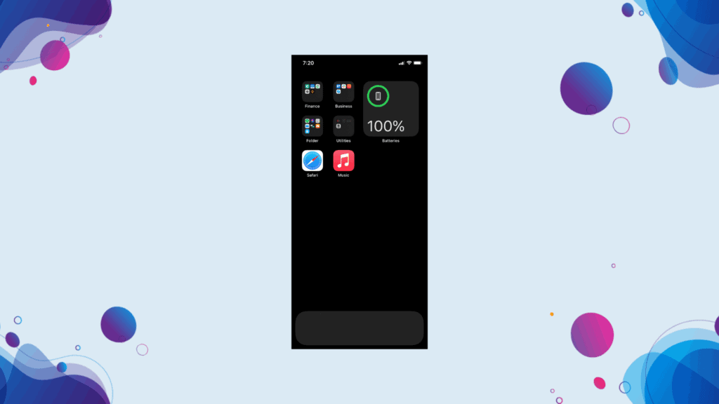
Have you ever experienced your iPhone, iPad, or iOS without icons on the dock? Well, there’s a first time for everything.
Although you might be skeptical at first, it can significantly change the whole outlook of your iOS 15 home screen.
Start by removing the icons from your dock and relocate them one window above. This change can be disturbing at first, but you’ll easily get used to it with time. Also, it’ll give a cool and unique look to your iDevice with minimal fuss.
Pro Tip:
You can group the icons residing in the dock and add them to a folder to easily access them.
Just in: Google Stadia can work on iOS devices with a simple browser trick.
8- Adding The Good Old App Box Wallpaper
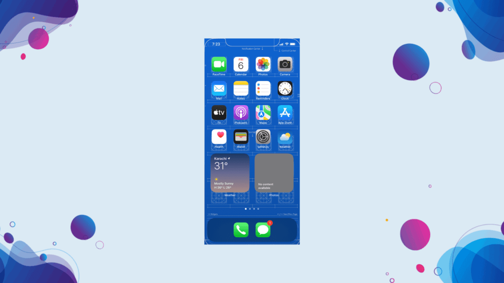
All the OG iOS users remember the time when app box wallpapers were the trend. Today, we are going to revisit those memories.
App box/shelve wallpapers are different from the standard wallpapers. They provide a rack to your apps & widgets – giving your home a neat & clean look.
There are thousands of free app box wallpapers available online. Just type in iOS box/shelve wallpaper on Google to find the one that suits your vibe.
Pro Tip:
Search for iOS blueprint wallpaper and thank us later!
9- Widget-Only Home
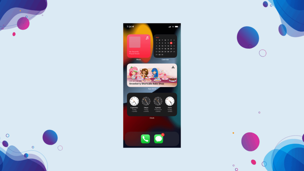
If icons are too dull for you, then it’s time to give your home screen a brand new look with just iOS widgets. From Snapchat to Facebook and messages, there are a handful of widgets available on iOS for the majority of popular apps.
Clear your home screen from all the icons and start adding your favorite widgets one by one. Then, arrange them on your home screen in a way that they perfectly complement each other.
You can access the removed app icons from the App Library of iOS 15.
Pro Tip:
Add each widget according to its priority as per your preferences. We’ll recommend adding widgets of apps like Contacts, Calendar, Clock, and Reminders, first.
10- Top-Center Widgets & Bottom Icons
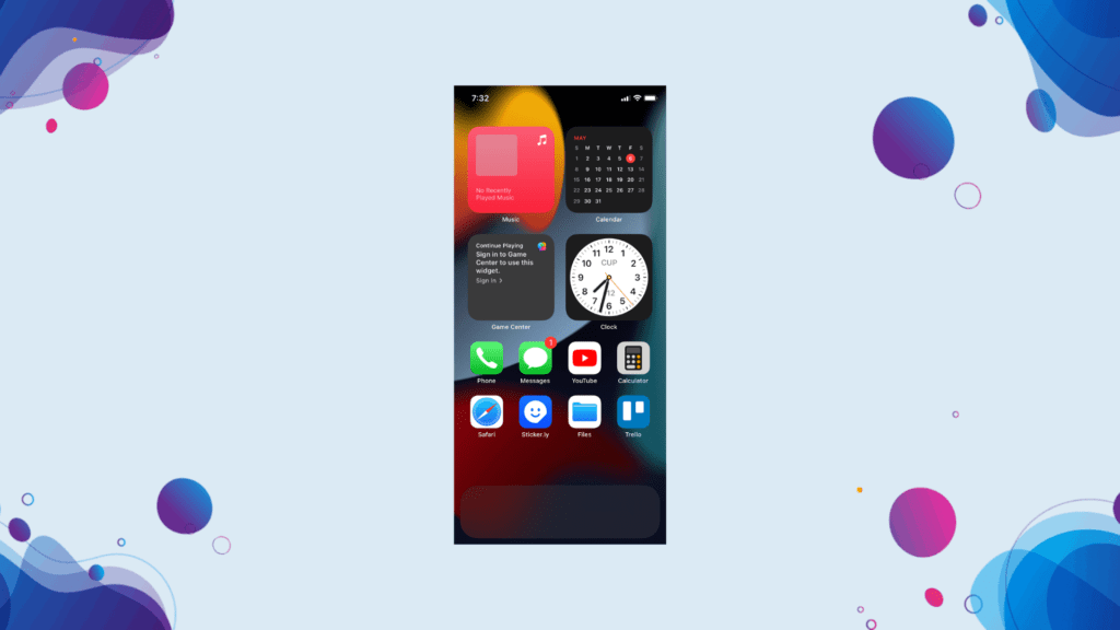
Don’t want to over-populate or super-minimize your iOS 15 home screen? Then, we have got just the plan for you.
Start by adding your favorite widgets on the top and center of your home screen. Then, place your favorite app icons on the bottom side of your screen.
This look will give your iDevice’s home screen a sleek and gorgeous look. You’ll easily be able to access your favorite apps without over/underloading things.
Pro tip:
Set a minimal or nordic wallpaper to make your home screen stand out with the idea.
iOS 15 Home Screen Ideas: Final Words
And that’s a wrap! Above are some of the best iOS 15 home screen ideas that’ll take the feel of your iDevice to the next level.
Which home screen idea are you planning to use? Or do you have a suggestion for us? Feel free to tell us in the comments section.
Till then, keep customizing your iPhone, iPod, or iPad.

